February 3 2025
Simple Toast Notifications using Vanilla Javascript
In this article:
This article explains how I added toast messages to my side-project, Tailcolors, with nothing but vanilla Javascript & CSS. I’ve also included some examples.
Here’s an example of these native Javascript toast notifications:
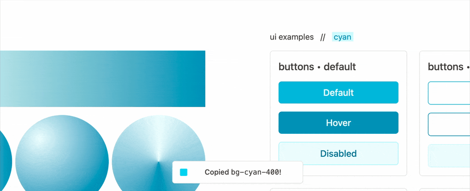 (GIF from tailcolors.com) — In just 25 lines of JS (plus some CSS) you can add toast notifications to your app. You can completely adjust the styling and timing, plus you have the flexibility to extend this with custom CSS classes, embed HTML elements etc.
Adding toast messages with vanilla Javascript is surprisingly easy. With about 25 lines of native Javascript (no framework) and some CSS (with some help from TailwindCSS) you can quickly add toast messages too.
Note: Using TailwindCSS is optional. You can just as easily use vanilla CSS here if you translate the Tailwind classes.
Javascript code for Toast Notifications
Here’s the plain Javascript code that powers those toast messages:
// TOAST.JS
//
const FADE_DUR = 500;
const DISPLAY_DUR = 3000;
let toastContain;

function toast(message, extraClasses) {
  // 1. create global container for toast messages with class .toastContain
  if (!toastContain) {
    toastContain = document.createElement("div");
    toastContain.classList.add("toastContain");
    document.body.appendChild(toastContain);
  }

  // 2. append toast with classes .toast + extraClasses
  const EL = document.createElement("div");
  EL.classList.add("toast", extraClasses);
  EL.innerText = message;
  toastContain.prepend(EL);

  // 3. transition the toast message
  setTimeout(() => EL.classList.add("open"), 10); // delay so transitions apply
  setTimeout(() => EL.classList.remove("open"), DISPLAY_DUR);
  setTimeout(() => toastContain.removeChild(EL), DISPLAY_DUR + FADE_DUR);
}
To quickly break down the key aspects of toast.js:
- First, we create the
toastContaindiv and maintain it’s global reference (for subsequent calls totoast()), - Then, we dynamically construct
EL, our element to add to thetoastContaindiv, including the suppliedtextand adding any additional classes (for success/error variants) - Finally we animate our toast in & out with
setTimeout. Use theFADE_DURandDISPLAY_DURconstants to control how long it takes to fade in, and how long it remains visible for.
Then we’ve got toast.css, the styles we apply. Again, note that using TailwindCSS is optional — you can translate these classes to vanilla CSS and it will still work.
CSS & Tailwind Styles for Toast Notifications
/* TOAST.CSS */

/* toast message container — centered bottom-middle */
.toastContain {
  @apply z-50 fixed left-1/2 bottom-16 w-fit min-w-72 -translate-x-1/2;
}

/* toast message, style as you need */
.toast {
  @apply opacity-0 min-h-8 -mt-10 rounded-md py-3 px-4 bg-white border border-stone-200 text-center shadow-xs;
}

/* toast message transitions (easier to do in native css vs tailwind) */
/* kept separate from above to make tailwind happy. */
.toast {
 transform: scale(0.9) translateY(50px);
 transition: margin-top 0.5s, transform 0.5s, opacity 0.5s;
}

/* how the toast transitions when it's transitioned in */
.toast.open {
  @apply mt-2 scale-100 translate-y-0 opacity-100;
}

/* Create different toasts by providing extraClasses and styling them here. */
.toast.success { ... }
.toast.failure { ... }
.toast.warning { ... }
To break the styles down this time:
.toastContainis positioned at afixedheight (withbottom-16) and centered (left-1/2andtranslate). It’s placed over everything else withz-50..toastinitially is invisible withopacity-0and it’s styled to match the UI of tailcolors.com. There’s a second.toastsection to keep the Tailwind and plain CSS classes separate since it’s easier to handle the transitions in CSS..toast.openapplies transition classes like making it visible and moving a bit
Note: CSS classes like
.success,.failureand.warningshould map to classes you’d supply totoast()asextraClasses.Example:
toast("Some warning!", ['warning'])
Conclusion & Final Example
So that’s it really! By combining a bit of Javascript and CSS, you can build a toast notification system in vanilla Javascript, no framework required.
Here’s another short example:
 Another short example of building toast notifications with vanilla Javascript.
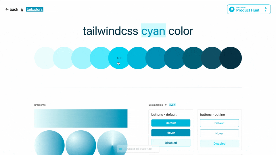
If you want to see a live example of these toast message, head to the Tailcolors Rose Color Page — a toast message appears after you click on a color or gradient to copy it.
If you enjoyed this, you’ll probably also like my article on tooltips with plain HTML & Tailwind CSS.
Thanks for reading!